Home » See Our Work » Brand Development
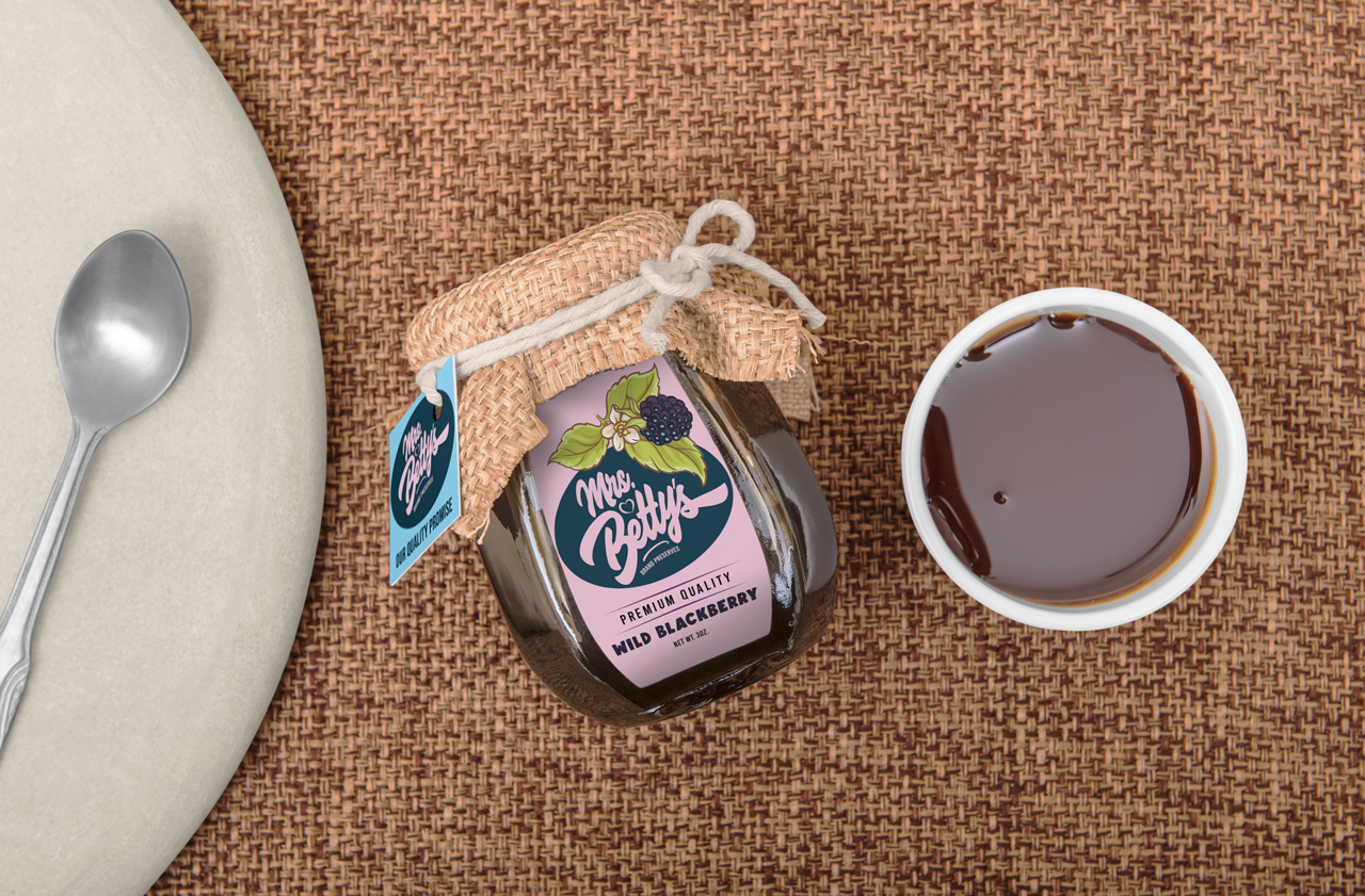
Mrs. Betty’s is one of thousands of products made under the State of Texas Cottage Food exemption as of 2013. Mrs. Betty’s harvests, prepares and packages seasonal jams and jellies on a private ranch in Northeast Texas. Acree Creative gave this small, homebased enterprise a professional packaged goods look and feel.

Brand is more than a logo. It is the representation of what you do and how you do it. You’re going to invest a lot of time and money into building that brand, so give it some serious consideration.
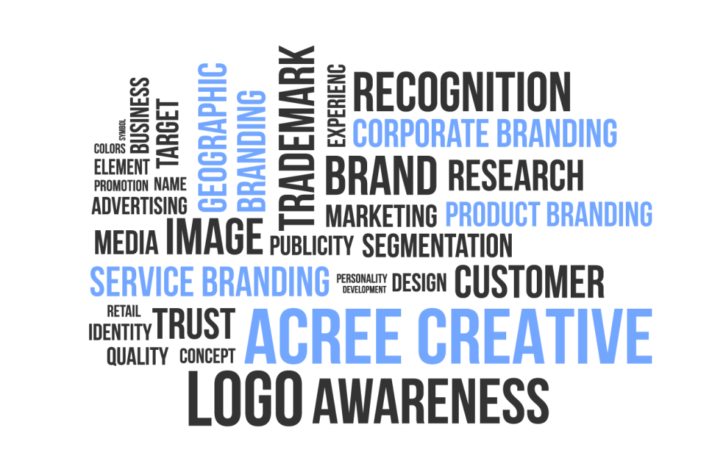
Focuses on the reputation of an entire corporation. The public associates the organization's name with a promise that they stand behind the services they offer.
Focuses on distinguishing what makes a product different from others. For example, a company that makes gourmet pet food might communicate how their pet food differs from others through their packaging and logo.
Similar to product branding, but focuses on services rather than products. Services are less tangible than products, so service brands can be harder to develop.
Focuses on the customers in a specific region and the traits of that region. This type of branding is often used in the tourism industry to attract people to a city, town, or state.
When you begin to work with a designer, keep in mind that you are dealing with a “creative” person. They tend to put their heart and soul into a project, if they don’t, you’re off to a bad start. Don’t be bullied into accepting something you can’t live with. If you are building a logo from the ground up allow for ideas that might challenge what you saw in your head.
By keeping an open mind and guiding the process by providing an understanding of your “brand”—what it means to you, and should portray to your customers and partners.
If all of the elements required for this one-dimentional representation of your company, service, or product have been understood, you will get a range of ideas.
Choose one or two that meet your criteria, then consider how they might be evolved to deliver the final version. I promise you, more is not better. Make your selections and improve those designs.
No matter how many design concepts are presented, there will be two or three that the designer has a fondness for. Be open to fresh ideas and allow yourself to be persuaded with a good pitch that makes sense to you.
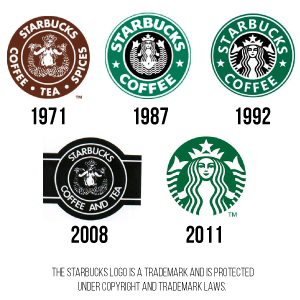
Brand evolution is common for companies as they adjust to changing trends and customer values and desires.
Companies going through a brand evolution take small steps to boost their services and appeal in the marketplace. Over the years, Starbucks™ has made big changes, not always embraced by the consumer.
Starbucks wasn’t always called Starbucks. The founders first named their company Pequod, after the whaling ship in the story of Moby-Dick. It didn’t catch on, so they switched it to Starbuck, who was the ship’s chief mate.
The first logo was a coffee brown color (earthly, stable, nurturing), and the mermaid was fully visible, holding her tail in both hands. The circular design allowed them to spin their company name around the logo, with the word’s coffee, tea, and spices—letting customers know what’s available.
Celebrating its 40th anniversary, the company decided to attempt a considerable rebranding effort. The result was a failure.
Celebrating its 40th anniversary, the company decided to attempt a considerable rebranding effort.
They reimagined the original 1971 logo with a few modern twists and changed the logo’s color from green to black.
The result was a failure, and they received huge backlash from their customers. Their green branding and simple logo design had become so popular and familiar to the public, that their audience refused to accept anything other than the beloved green logo. ♦